BORD: Learning Platform for Enterprise Training
A modular course builder and learner experience with quizzes, progress tracking, and a marketplace for pre-made training content.
Client
Confidential client
Deliverables
Product strategy support
UX/UI design
Information architecture
Interaction design
Prototyping
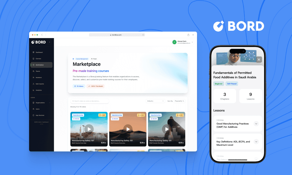
One product across two surfaces
Admins build and buy courses on desktop; learners take them on mobile. The case study follows both paths in the order the product is actually used.
01 Context
Training that is frequent, mandatory, and has to be seen.
BORD targets organizations where training is frequent, mandatory, and requires visibility, often across multiple teams, job roles and compliance regimes at once.
The brief was never only “build a course builder”. It was an end-to-end system: admins create and manage content quickly, learners progress smoothly through lessons and quizzes, and the organization scales its catalogue through a marketplace and subscriptions.
02 The problem
Enterprise training breaks in the same five places.
Each failure compounds the next: setup friction means fewer courses, thin courses mean low completion, and results that go nowhere mean nothing improves.
01
High setup friction
Creating a course structure takes time and coordination before anything is publishable.
02
Low completion
Learner experiences are boring or unclear, and rarely show progress in a way that motivates.
03
No feedback loop
Quizzes exist, but results don’t translate into anything actionable for either side.
04
Scaling is hard
Organizations don’t want to build every course from scratch, and have no route to reuse.
05
Fragmented admin
Dashboards, subscriptions, teams and catalogue management feel like separate tools.
03 Success criteria
The metrics were agreed before the build, not after it.
BORD had not shipped while I was on the project, so there are no post-launch figures here. What I owned was the definition of success itself: the metrics the client would judge it by, agreed early enough that instrumentation shipped with the screens rather than after them.
Leading indicators split three ways. Admin: course created, modules and assessments added, course published. Learner: onboarding completed, lessons started, quizzes completed, milestones reached. Organization: subscriptions completed, courses assigned, monthly completions rising.
Time to first learning value: from creating or selecting a course to the moment learners start progressing, and admins can see it.
04 Design principles
Five rules the whole product had to answer to.
Every screen below was argued against these. Where two of them conflicted, the earlier one won.
01
Time to first value
Get admins from an empty state to a publishable course fast.
02
Clarity over complexity
Structured content creation and simple progress visuals, never long unstructured forms.
03
Feedback drives improvement
Quizzes and results should tell the user what to do next, not just score them.
04
Scale through reuse
Marketplace and subscriptions reduce repeated work across the organization.
05
One product, not two
The admin and learner experiences should feel like the same thing.
05 The admin experience
Create a course, structure it, publish it, all in one continuous workflow.
Course creation opens on a single choice, Create with AI or Start from scratch, so the flow serves both fast generation and full control. The builder then takes structured input rather than one long form: course details first, then modules, lessons and assessments.
Empty states name the next action (“Add module”, “Create a lesson”), save-state feedback and an explicit Publish remove any doubt about whether work was kept. Assessments follow one pattern whatever the question type: choose the type, write the question, define the options, set the correct answer.

The first decision, made once
Create with AI or start from scratch. Everything downstream is the same builder, so the choice costs nothing later.

Start from scratch
Organization, title and thumbnail: the three things needed before the builder can open.

Course details
Description, difficulty, categories, duration and whether the course is mandatory.
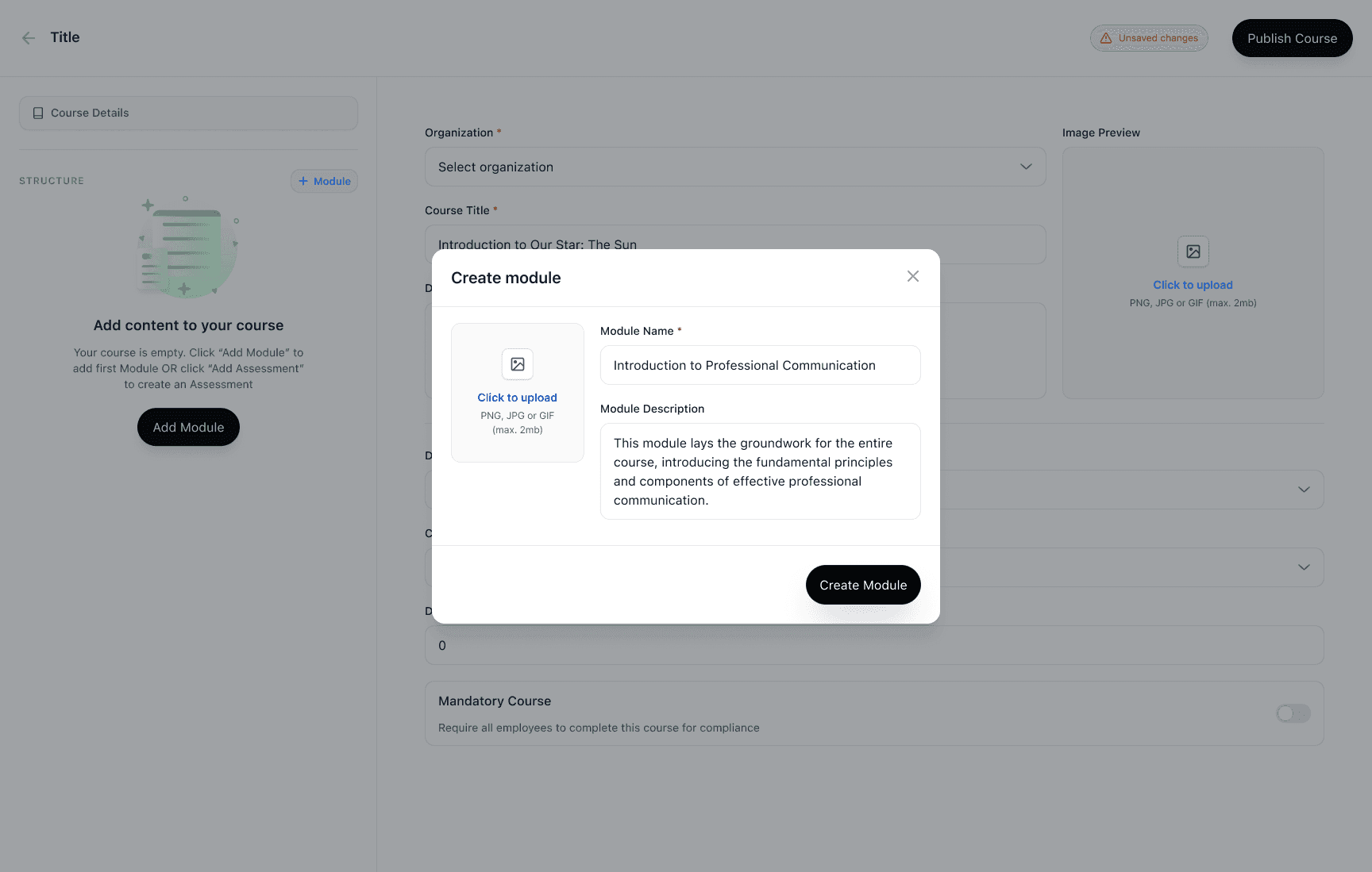
Modules before lessons
Structure comes first, so the course has a shape before any content is written into it.

Assessments as content
An assessment is built in the same place as a lesson, not in a separate quiz tool.

Three question types, one pattern
Single choice, multiple choice, true/false. The steps are identical in each.
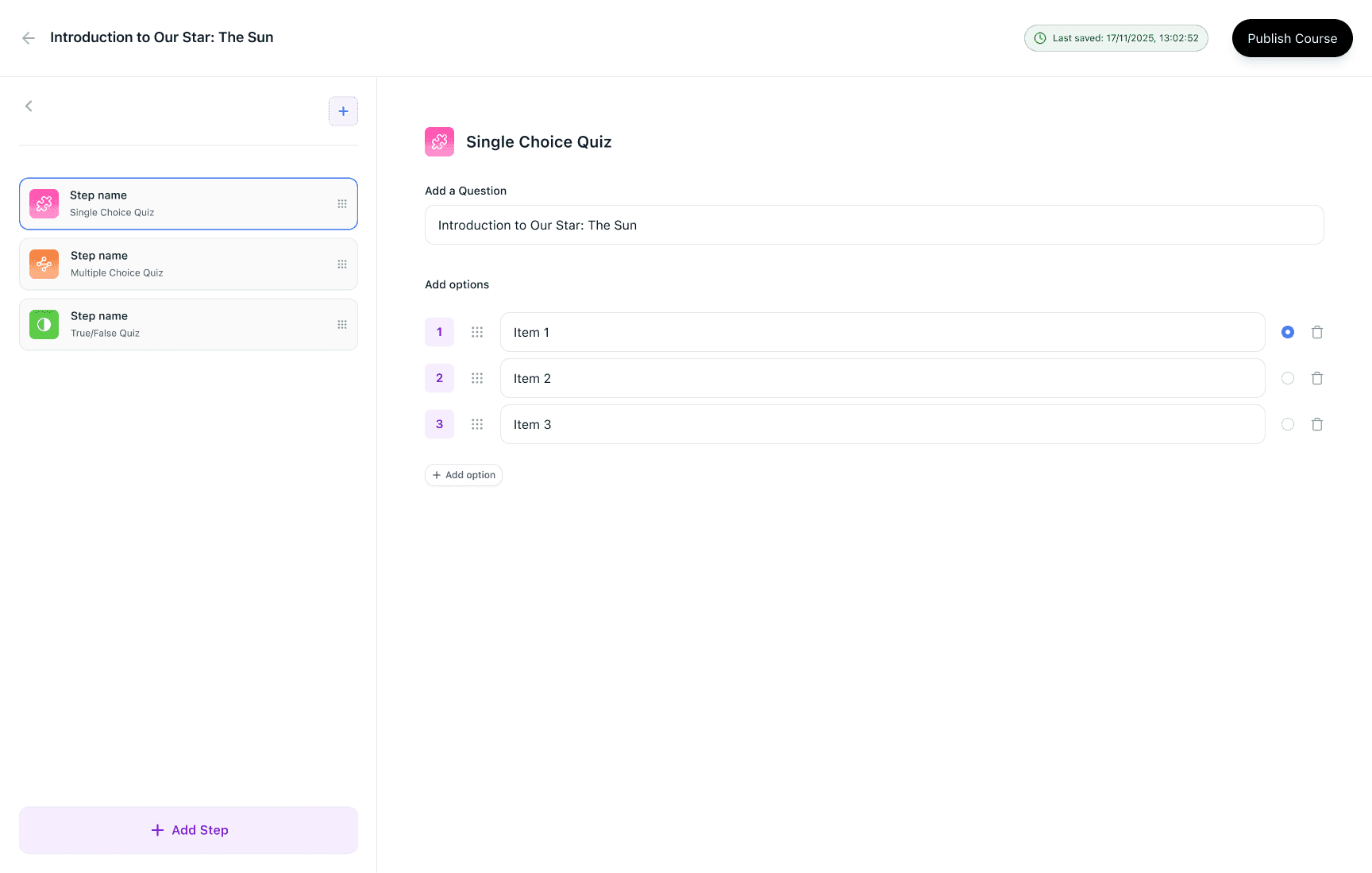
Options and the right answer
The correct answer is set in the same view as the options, so nothing is defined twice.

The course, assembled
Details and structure on one surface: modules, lessons and assessments in the order a learner will meet them.
06 Marketplace and subscriptions
Buying a course had to be as easy as building one.
To cut repeated work, the marketplace lets a team find pre-made courses by industry and subscribe on the spot. The flow is deliberately three steps, preview then summary then payment, and subscriptions management then gives one place to read cost, assignment and monthly completions.

Catalogue, filtered by industry
Search, industry filter and sorting, because the reason to be here is a specific compliance need.

Preview before commitment
Learning objectives, audience and module count: enough to judge fit without subscribing first.

Summary, then payment
One screen states what is being bought and for how long before any card details are asked for.

What is active, assigned and completing
Status, price, assigned users and monthly completions in one list, so renewal is an informed decision.
07 The learning journey
Learn, check understanding, get feedback, continue.
Progress rate appears on every key screen, so learners always know where they stand and completion stays believable. Quizzes are light but structured: immediate clarity on what was selected, then a result that gives a reason to carry on.
A strong score is celebrated plainly. A weak one avoids shame and points at the work: “Keep practicing”, plus a review mode showing what was wrong and what the right answer was. First-time onboarding explains why the score matters at all, connecting personal improvement to professional impact.
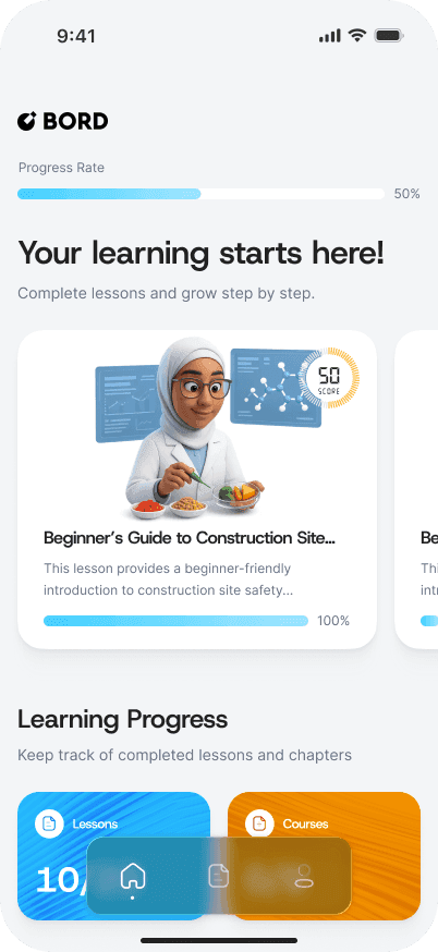
Where you stand, on opening
Progress rate leads the dashboard rather than hiding inside a course.
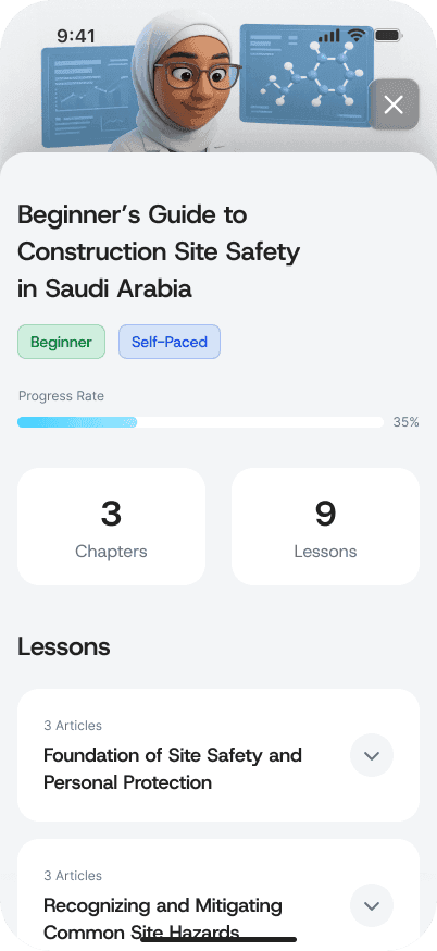
The course, as a list you can finish
Lessons in order with progress above them, so the remaining work is always countable.

One question at a time
Selection state is unambiguous before anything is submitted.

A good score, stated plainly
Score and confirmation, without turning the moment into a game.

A weak score, without shame
“Keep practicing” plus a review of what was answered and what was correct.

Why the score exists
Shown once, before the first quiz, so the number means something when it arrives.
08 What I owned
End to end, on both surfaces.
I was the only designer on the product for this stretch, across admin and learner.
Specifically:
Admin workflows end to end: course creation, structure, assessments, publish
Marketplace discovery and the subscription flow: preview, summary, payment
Subscriptions management for ongoing admin visibility and action
The learner journey across mobile: onboarding, progress, quizzes, results
Consistent patterns for empty states, CTAs, modals and progressive disclosure
09 What I would improve next
Where I would take it with more time.
None of these were cut for disagreement; they were the next things on the list when the engagement ended.
In priority order:
Assignment flows: assigning courses to teams and users straight from marketplace and subscriptions
Analytics depth: cohort completion, drop-off per lesson, quiz difficulty calibration
Content reuse: templates and cloning for faster course creation
Accessibility: contrast, keyboard navigation and screen-reader labels for the admin tables
Edge states: failed payments, empty results, incomplete drafts, quiz retries
Next project